
Text: Joachim Pitz | Section: Early Connections between Science and (Visual) Art
Abstract: Art and natural sciences are often considered opposites in terms of content and methodology. However, my personal interest in both fields and my simultaneous study of art and chemistry have led me to believe that both profit from a mutual understanding of their thought and working processes. Chemistry provides material from which art can be created, and the natural sciences open up new thematic areas for art. For over 10 years I have been pursuing the goal of creating visual ideas by artistic means that can help solve scientific problems.
I search for similarities and connections between visual art and natural science because I believe that both profit from an awareness for one another’s thought and working processes. I have been producing science-related, specifically chemistry-related art since 1971. This did not involve successive, self-contained phases — rather, I was experimenting with many forms of expression at the same time with varying scientific topics. I took images from textbooks and science magazines that related to physics, biology and chemistry. My artistic approach was not yet settled on a specific process either. It ranged from drawing to etching, from conventional painting to the first time using methods I had learnt from my chemistry degree, such as separation processes, precipitation reactions and burning processes to make painting pigments. I also experimented with unconventional materials such as bitumen, cement, wax, soot, graphite and asphalt, which resulted in small sculptures, ceramics, relief paintings and other objects.
I’d like to take a closer look at the first picture that has a scientific background from 1971, because the approach is typical of the early paintings.
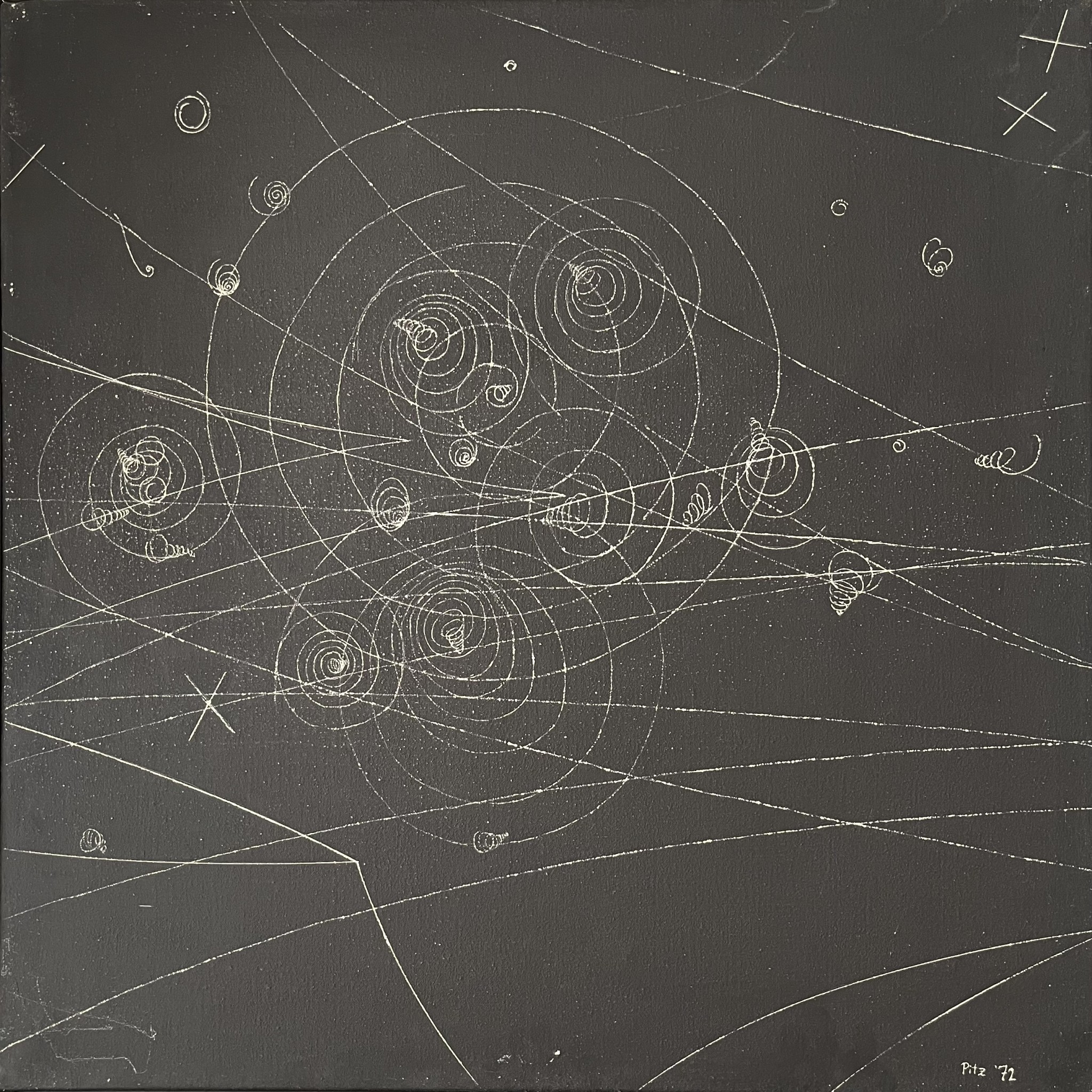
The reference for this first picture came from a science magazine. It depicts a process occurring in a bubble chamber at the German Electron Synchrotron (DESY) in Hamburg; its graphical appeal and the scientific background impressed me. I informed myself about the technical setup and the physical purpose behind the experiment and thought about how I could create an artistic representation of it. Conventional painting on a black primer didn’t work for me because I couldn’t achieve the finesse of the lines. At the time I was also working on etchings and using cold needles. The etching needle seemed to be the most suited tool.
I recalled a painting by Paul Klee; it had a dark topcoat, into which he scratched fine lines to reveal the base layer. This seemed like the way to go. I primed a canvas (70 x 70 cm) with white emulsion paint and painted over it in matt black. Irregularities in the woven texture of the nettle canvas were still visible. I enlarged the motif to the desired size on tracing paper and, after rubbing the back with graphite, transferred it onto the canvas. Using an etching needle I then scratched the motif into the canvas to expose the white primer. This resulted in fine lines that swelled at certain points due to the woven structure. I was happy with the outcome. The lines, in their slight irregularities, reminded me of very fine gas bubbles — and I noticed yet another similarity: unlike painting, I didn’t have to add anything. Instead, the lines emerged from the material that was already there, as in the experiment itself. I suppose my appreciation for the foundation, the base, already began back then.
In a letter to DESY I asked for more image material, as well as the permission to utilise it artistically. They sent me two large black and white photographs and the desired permit. Thus, I embarked on my first picture series against a purely scientific background. I kept coming back to these bubble chamber structures, even in paintings created much later.
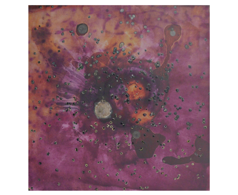
This first picture series was made, as mentioned above, in 1971/72. Probably around the same time, I also made the first purely chemistry-related painting: a small landscape on watercolour board. I primed the surface with a diluted white emulsion paint mixed with some table salt and shaped a damp plaster bandage into a mountainous landscape. After hardening, I painted onto the still damp plaster with silver nitrate solution and was fascinated to observe how, under the influence of light, the delicate violet tones developed into an increasingly rich violet-brown hue. The result, once dry, was a varied gradation of brown to black, reminiscent of old black and white photographs. From then on, I regularly worked with scientific content and chemical substances using various techniques. I also enhanced conventional techniques with self-made colours from metal oxides and collected earth pigments that were purified, sometimes even fired, and then processed into oil paints. It was only after moving to The Hague and settling into a bigger studio space in 1986 that I began to work consistently with scientific and technical themes in bigger picture formats, the contents and intentions of which I summarised in an artistic programme at an exhibition in 1989.[1] After returning to Germany in 1991, my works continued to follow this programme up until my so far last exhibition in 2000 at the Marburger Kunstverein. Afterwards, I focused on topics from cosmology and quantum theory. The reason I limited myself to these topics and also decided not to take part in further exhibitions resulted from many conversations and discussions with visitors, also with scientists, who appreciated the decorative charm and unusual themes, but could not or did not want to follow my actual intention of bringing art and natural sciences together at eye level.
In 2017, I was able to present a preliminary outcome. I had developed an alternative concept of cosmogony based on space quanta predominantly using artistic means and published it as a treatise online at art-and-science-pitz.com.[2] Currently, I am fine tuning this concept, revamping its online presence and assessing both cognitively and artistically how robust it is from a physics perspective.
Cosmology and Quantum Theory
I want to understand what is happening, how the world operates on the smallest and largest scale. That’s why I make paintings like those pictured above; it enables me to think and feel my way into these dimensions. I have my doubts about the Big Bang theory, about the idea that everything emerged from nothing and fell so perfectly into place, how we observe its ongoing development, yet can’t always explain it. Physically, this beginning also remains unexplained; it is a so-called singularity in which the laws of physics do not apply. Quantum theory captures the smallest realms but doesn’t provide a coherent connection to cosmic dimensions. I have faith that, in addition to formal logic, alternative ways of thinking can help us towards a solution to these problems. Art offers more freedom by utilising all our mental and sensory abilities such as illogical confrontations, free combinatorics, controlled coincidence, subjectivism, emotional judgment and the like. Of course these means are not suited to provide findings in scientific terminology, but they can create visual ideas that can then be articulated in scientific terms.
The goal of my paintings on cosmology is not to produce photographically accurate depictions of originals provided by the Hubble and Webb telescopes. Instead, I want to reveal more than just the visible; I want to make energy flows, forces, matter and radiation palpable. For this reason, I use conventional paints sparingly: I consider the canvas a testing ground where simple chemical reactions occur, like the precipitation of coloured salts, photosensitive processes, and reactions with atmospheric oxygen. The colours and substances created in this way are more real and authentic — they are made according to the laws of nature, just like what they are intended to represent, and are then processed further in line with the core theme.
The Working Method
Inspired by scientific publications and driven by personal interest, I acquire background knowledge on an issue within the chosen subject area. Where necessary, I compare different perspectives and gradually form my own understanding, which is often also influenced by the images in these articles. In the following I’d like to explain the material realisation into a concrete painting using the example of a cosmic landscape.
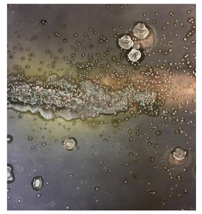
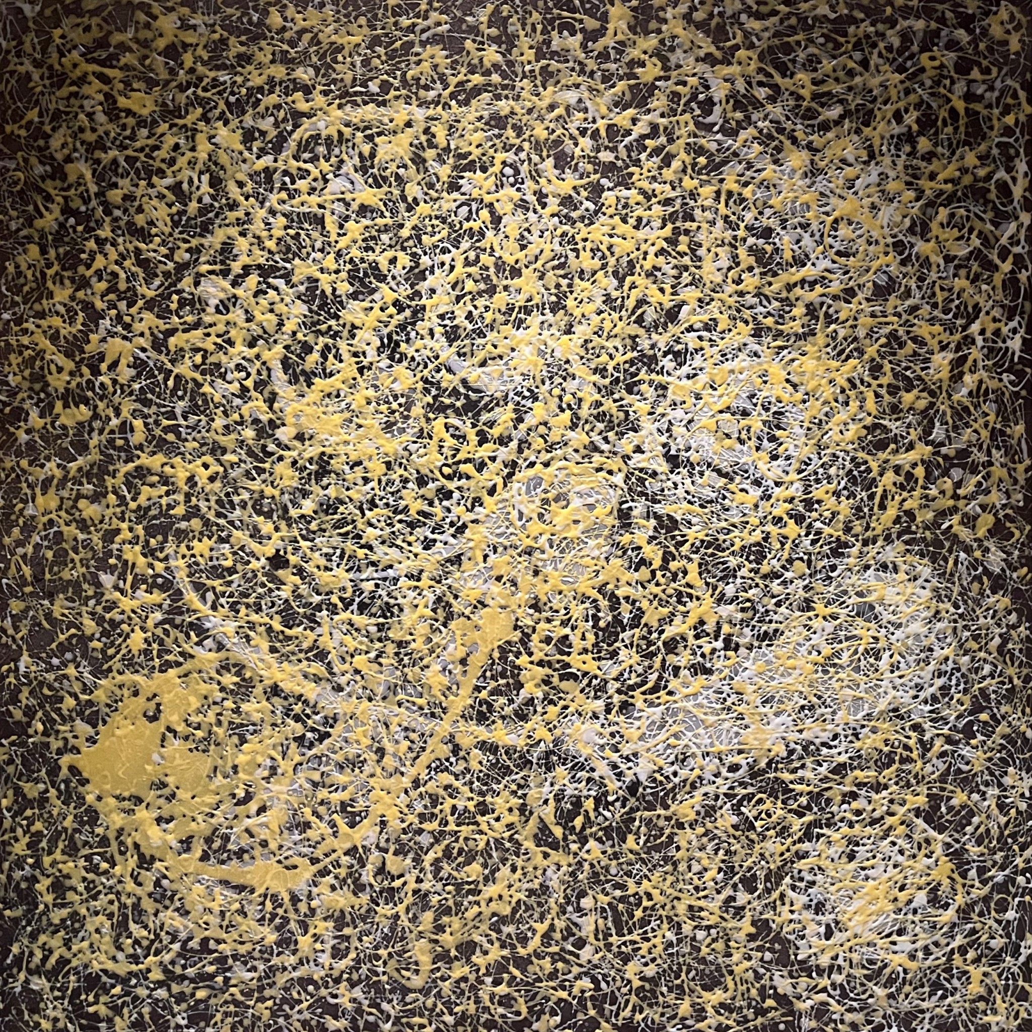
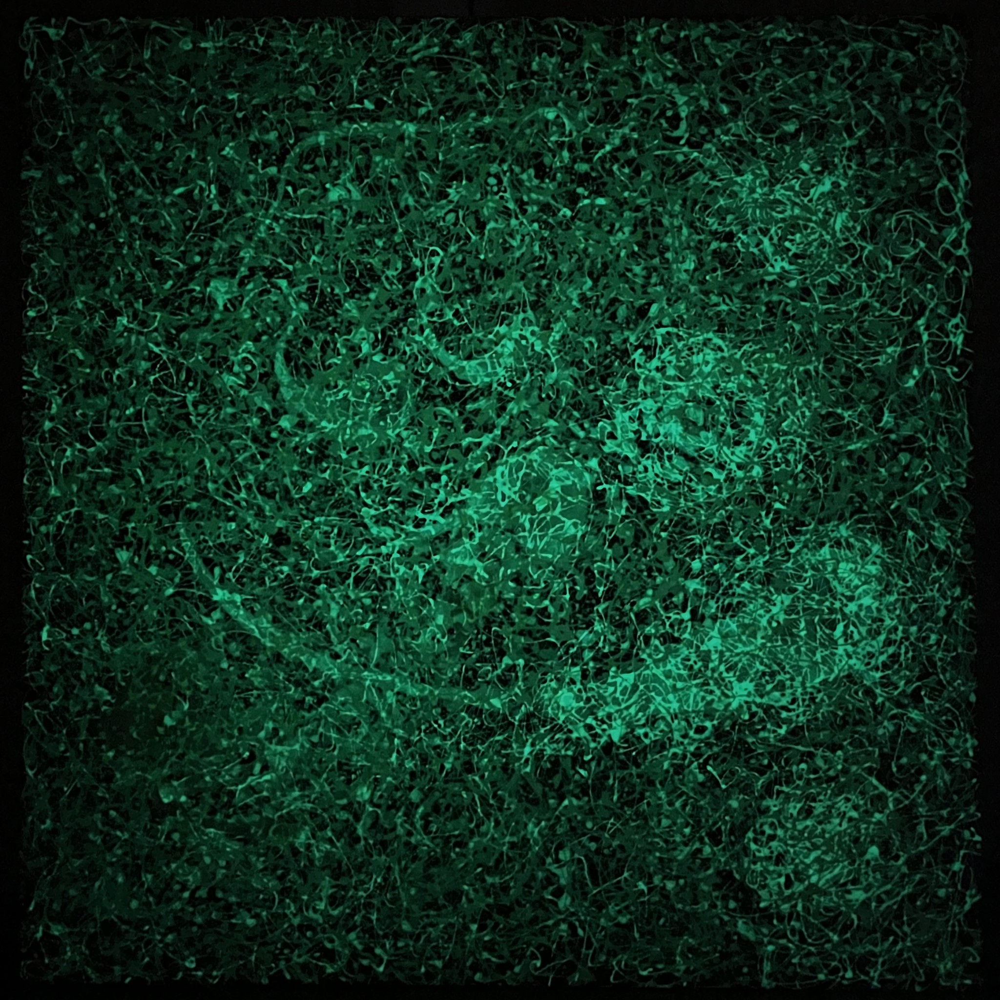
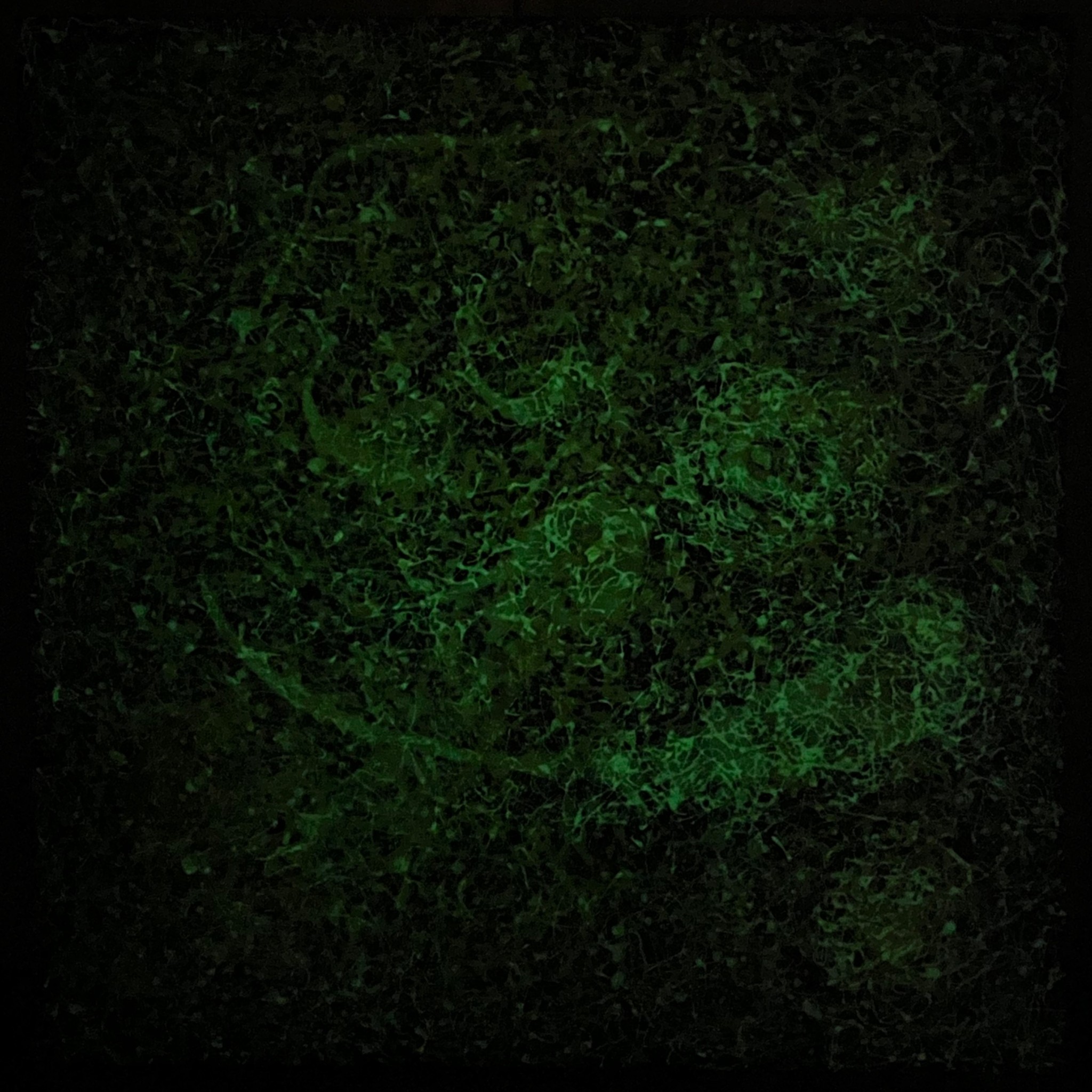
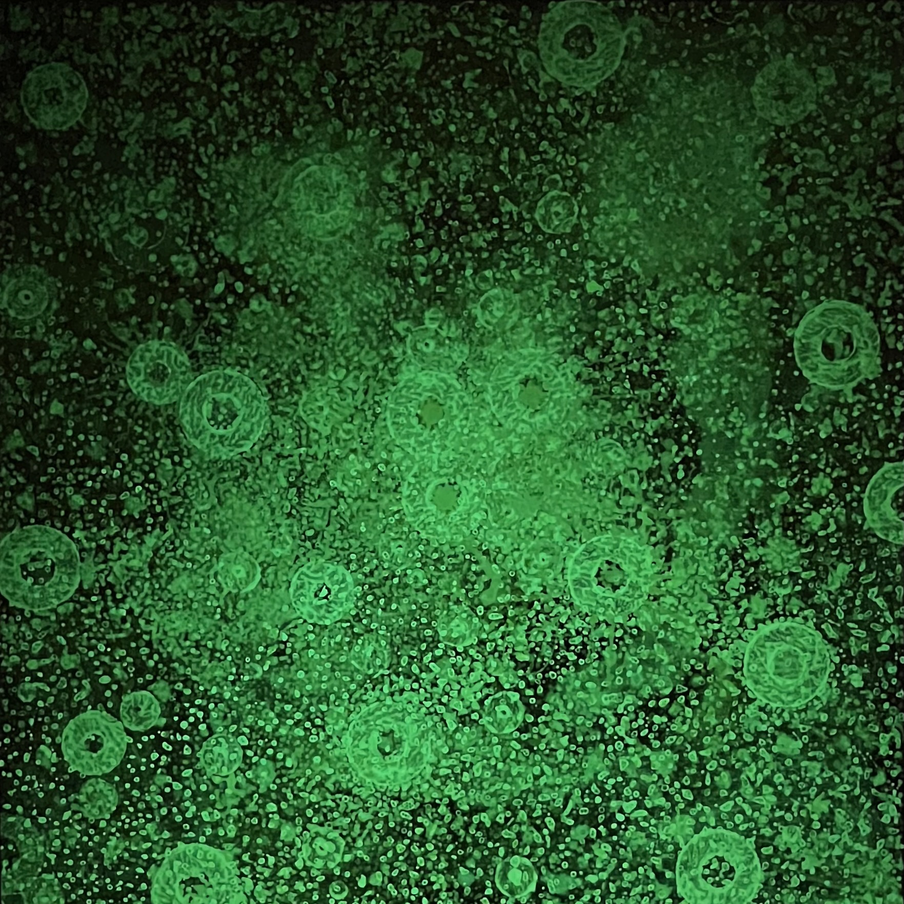
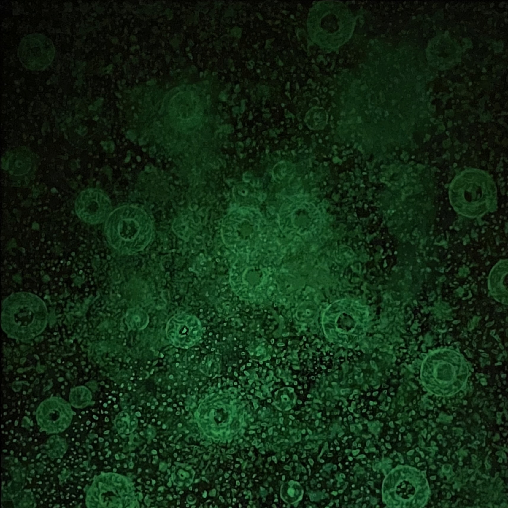
For the image support, I built a wooden frame to which I attached a waterproof plywood board (122 x 122 cm). I then stuck a canvas onto the board using wallpaper paste and waterproof wood glue. At this stage, the canvas could still be folded and structured to some extent, which could later be interpreted as force fields or field lines. Once it had partially dried, I coloured the surface with one or more fabric dyes, finishing with an intense black. These dyes, which I sometimes mixed with a little table salt, penetrated the unprimed canvas and, after drying, formed a relatively uniform matt surface, with irregularities here and there caused by the unevenly distributed glue. Next, I dropped small iron pellets onto the canvas from a certain height, without correcting their random distribution. I stuck them down with waterproof wood glue, intended to represent the seemingly random distribution of stars. Inspired by the irregularities of the surface and the random arrangement of the iron pellets, I then selected areas for galaxies, interstellar gases, magnetic fields and the like. To do this, I sprayed these areas with a sodium hypochlorite solution, followed by vinegar concentrate. This released chlorine gas, which destroyed the fabric dye and resulted in irregular colour gradations at the edges that varied according to the composition of the dyes used. This colouration could be enhanced by targeted colour salt precipitations. To increase their luminosity, I often used phosphorescent pigments that I applied in varying concentrations with a little acrylic binding agent around the iron pellets and larger areas of colour. I then used compressed air to distribute them, creating cloud-like formations. The pigments produced a unique glow and impressive effects in the dark room. Over time their luminosity wore off, adding a temporal dimension to the work.
Throughout the entire process, which could last several days/weeks due to reaction and drying times, my thoughts were deep into the subject matter and new ideas and solutions kept emerging — both in terms of content and how to proceed with the painting. I was always aware of the physical presence of the painting: the paradoxical situation that I wanted to portray the emptiness of the universe with something material, colourful, dense and at times heavy. This led to the question of whether the cosmos really is as empty as it seems: does a free vacuum even exist or are our senses and physical measurement methods insufficient to grasp reality in its entirety? This triggered both a cognitive engagement and an emotional response: mentally, I immersed myself in a world far beyond my usual experiences, and yet I belonged to it — to the infinite universe and the unimaginably small dimensions in the realm of quantum physics. There was no way around it. Feelings of fear, uncertainty and isolation influenced my further decision-making on how to proceed with the painting. This could, similar to working with phosphorescent colours, result in unintended harmonies and dissonances in the painting, or lead to other influences. The distribution of these elements within the artwork and the control over their effects required a constant alternation of bright light and deep darkness, which made the working situation all the more tense.
My hope is that viewers approach my artworks with contemplation, delve into the realm of the smallest and largest dimensions, and have an experience somewhat similar to mine when I created them.
I’d like to briefly touch upon the pictorial significance of spatiality, colour and the image support.
Spatiality
The spatial quality of my paintings mostly relies on overlaps, size relations, colour perspective and the distribution of light and dark. Linear perspectives are relatively rare due to the nature of the content. Depending on the shade and inherent brightness of the colours, they either stand out or fade into the background; more or less the same applies to light-dark contrasts. I can utilise these properties to create spatial illusions. These effects can be intensified by using phosphorescent paints, which absorb light energy and gradually release it as coloured light. By varying both the quality and quantity, surprising spatial illusions can be achieved that are further enhanced by complementary effects in the dark room. It is fascinating to see what a wealth of spatial perceptions emerge as time goes by — to the point of subtle illusions of movement. These phenomena again trace back to the quantum mechanical level of interactions between photons and electrons.
Colour
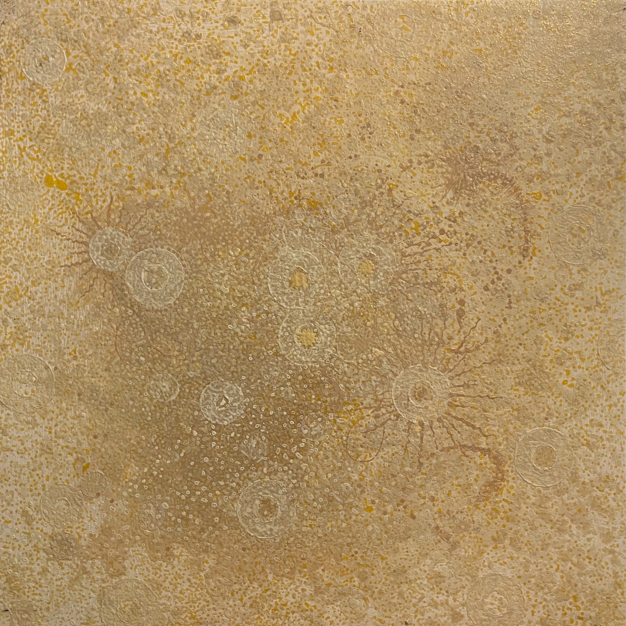
I hardly ever use industrially manufactured paints with the typical binding agents because they seal the surface both functionally and optically; they adhere to it. Fabric dyes and self-made paints are different: they penetrate into the substrate and adhere within it. I aim to show the colour in its formation, drying and possibly crystallisation process, as well as its physiological perception depending on light and the environment. I want to show it as a quantum phenomenon in the interaction of energy and electron configurations in the surface layers. I’d also like to highlight the role it plays in the complex interplay of sensory processing in creating after-images, spatial effects and perceived movement. These colours can serve as indicators for incoming energy, the exposure to air or humidity. Used in this way, they are often more sensitive than conventional paints. They often change over extended periods of time, especially the paints that interact with light. While working with them, it is not possible to plan out the exact shade of colour. The desired colour only begins to appear over time due to the reaction process and drying. If one is satisfied with the colours, they can be preserved using transparent binding agents; if not, they can be left to continue reacting with other substances, or even destroyed with aggressive chemicals, depending on one’s intentions for the work. All these manipulations lead to colour tones and gradients that are almost impossible to achieve through conventional painting techniques.
The Foundation
From the very beginning, ever since I started working on this topic, the foundation — the image support — has always held special significance for me. Whether it’s made of canvas, photographic paper, metal, wood or plastic, I consider it an equally important formal element that is inseparable from the colours and textures later applied. It serves as a carrier, as a reaction medium or even reacts with the chemicals itself.
The Beginnings
My interest in fine arts and natural sciences goes as far back as my school days. In the early 1970s, I studied chemistry and fine art in Stuttgart (with K.R.H. Sonderborg, among others) for a teaching degree at high schools. I went on to work as a teacher at various schools until my retirement. As part of an exhibition in The Hague (I was working at the German School there at the time), I formulated the aforementioned artistic programme, which I still largely follow today. For over 10 years I have been looking for ways to create pictorial ideas by artistic means that can contribute to solving scientific problems.
Another w/k article, which will delve into the various early attempts to connect visual art and natural sciences, is currently underway.
Details of the cover image: Joachim Pitz: Cosmic Landscape VI (2010). Photo: Joachim Pitz.
[1] Appeared in 2000 in the catalogue Natur, Kunst, Naturwissenschaft (Nature, Art, Natural Science) for the exhibition at the Marburger Kunstverein. First distributed as a handout at the exhibition in The Hague.
[2] Traktat zur Kosmogonie. Entwurf zur Entstehung des Kosmos auf der Basis von Raumquanten. Entwickelt mit künstlerischen Methoden. (Treatise on Cosmogony. Concept for the origin of the cosmos on the basis of space quanta. Developed with artistic methods.) Online at: http://art-and-science-pitz.com
Translated by Rebecca Grundmann.
How to cite this article
Joachim Pitz (2023): My Chemistry-Related Art. w/k–Between Science & Art Journal. https://doi.org/10.55597/e9246

Be First to Comment