
Bernd Eberhart, Sandra Teschow and Thomas Susanka in conversation with Anna-Sophie Jürgens and Crystal-Leigh Clitheroe | Series: Visual Science Storytelling, Sequential Art & Illustrated Science Communication
Abstract: Science Notes is a mesmerising magazine that showcases the work of visual artists exploring the interface between science and society; a magazine that excites our imagination about science through stunning illustrations and artful visual stories. In this interview with some of the key masterminds behind Science Notes – the Co-Founder Bernd Eberhard, the Art Director Sandra Teschow and the Editor-in-Chief Thomas Susanka – we unveil the artistic concept of the magazine. Tapping into the unique and creative genesis of the magazine as a whole – itself an imaginatively curated project – this article discusses the creative ‘reinvention’ of the format of each distinct periodical, which always profoundly and intuitively connects to that issue’s theme. Bernd Eberhart, Sandra Teschow and Thomas Susanka walk us through the design principles and aesthetic choices they make in order to communicate science in ways that bring the brighter and lighter(hearted) elements of science to the surface. Art and science collaborations, this article shows, are emblematic of science communication theory and practice that emphasise aesthetics and design as key to accessible engagement with science.
Bernd Eberhart, Sandra Teschow and Thomas Susanka, it is a great pleasure to welcome you to our online journal w/k! Science Notes is a visually captivating science magazine that explores the interface between research and society together with authors, photographers, illustrators and artists, under the guidance of art director Sandra Teschow, to make science “understandable and tangible” as well as diverse and surprising. Bernd, you are a science journalist, author, editor and co-founder of Science Notes magazine, whose editor-in-chief is Thomas Susanka. All of this is really interesting to w/k, and in this article we invite you to reflect on both the power of visual art and illustration to communicate knowledge and to excite the public imagination about science, with the aim of better understanding the artistic concept behind the unique Science Notes magazine.
Bernd, Sandra, Thomas: Hi Anna-Sophie, thank you! Great to be here!
Bernd, as one of the founders and editors of Science Notes, how would you describe the uniqueness of your magazine for our readers in just a few sentences? It is a magazine for “knowledge and society”, but what does that mean?
There are a lot of magazines about science on the German market, and a lot of magazines that deal with social and cultural topics – but there has not been a magazine that combines both perspectives. So we wanted to fill this gap – we created just the kind of magazine we were missing. Plus: Some of the existing cultural magazines are really pretty. The sciencey magazines, not so much. We wanted a stylish, well-designed magazine to make science accessible to a larger public. That was a big point for us from the beginning on.
How do you define “knowledge”? What knowledge(s) do you want to explore and what not? And, why did you decide to focus on knowledge in the subtitle, and not science, since many articles are about scientific topics, science discoveries and insights?
Bernd: We do focus more on science and especially the natural sciences rather than on the much broader term “knowledge”. Our subtitle in German reads “Magazin für Wissen und Gesellschaft”, which really translates to “magazine for knowledge and society”. Of course, science generates knowledge, and this knowledge should play an important role in societal decision making. Another reason for the choice of this subtitle is quite simply that the German “Wissen” ( = knowledge) sounds much nicer and catchier than “Wissenschaft” ( = science).
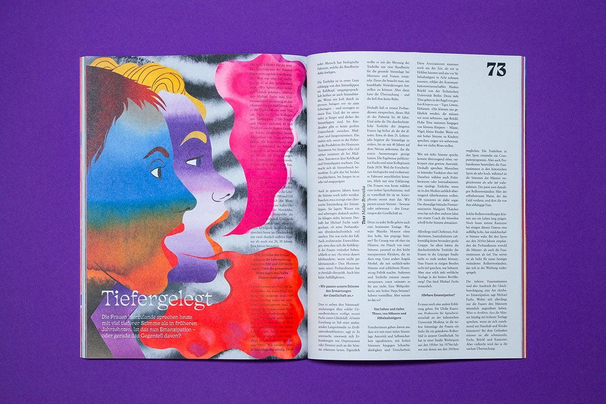
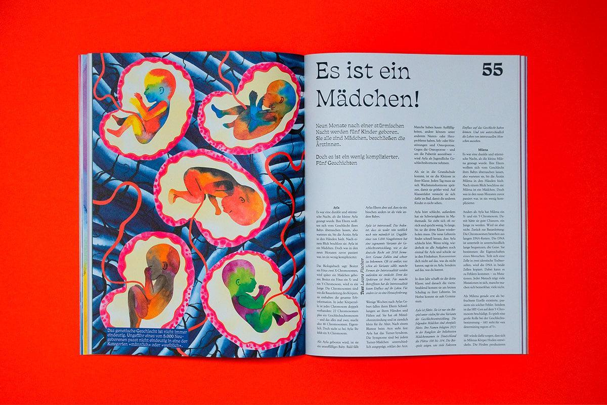
Science Notes 8: Was ist Frau? Screenshots from website.
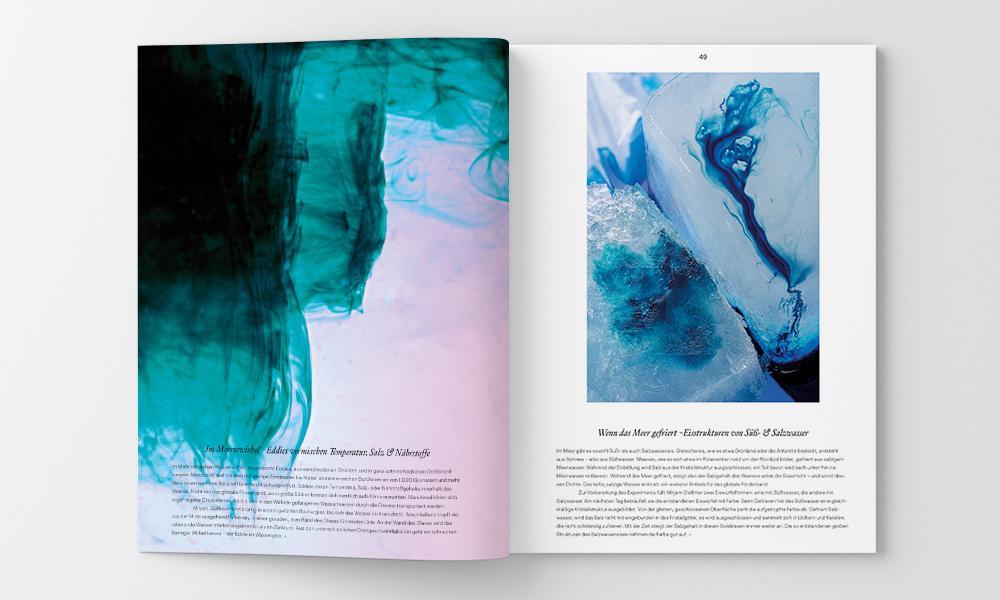
Science Notes 5: “Meer”. Note by the authors: We asked the photographer David Carreno Hansen to do “kitchen oceanography” to perform a series of experiments that can be done in any kitchen and tell a lot about processes in the ocean, e.g. about currents, waves, salinity, the distribution of nutrients …
MAKING SCIENCE NOTES
Why, how and for whom was Science Notes created? How has it been received so far?
Bernd: Well, the why is because we were missing this magazine on the market and thought that it would be a great way to present science as something accessible. The how is a longer story: There had already been a thing called Science Notes before – our editor in charge, Thomas Susanka, had created this event format that invited renowned scientists to talk about their work. The speakers were not talking in a lecture hall, though; they were invited to night clubs in cities all over Germany. That was the new thing about it. The Science Notes events are still ongoing in the same format: Every event has its own theme (e.g. climate change, garbage, AI…) and there are five scientists as speakers, but there are also live sets of electronic music, people have drinks and enjoy themselves… When I attended one of the events as a freelance science journalist, I was really stoked about the atmosphere and this really playful, accessible way of presenting science to an audience. Afterwards, I contacted Thomas and said something like: Wouldn’t it be possible to take this energy, this engaging atmosphere and put it in a magazine? And Thomas said: I’ve been thinking about this, too! So we did it. Of course, it took a lot of work and time, and we could not have done it without Olaf Kramer – he is Professor for Rhetoric at the University of Tübingen and co-creator of the Science Notes events. He had super important ideas and plans for the magazines and all the right contacts. And we were very lucky to convince a German foundation with our concept, the “Klaus Tschira Stiftung” (KTS). The KTS makes Science Notes Magazin possible – and makes it one of the first examples of foundation-funded (science) journalism in Germany.
And for whom did we create it? Well, basically for everyone who is interested in science, but probably wouldn’t read one of the established science magazines. It was for people who also like good designs and good stories. In the beginning, it was hard to find an audience, although the feedback had been very enthusiastic from the beginning. It took some time, but now we have a steady reader base and a growing print run.
Science Notes is dedicated to topics such as “Melting”, “Animals” or “Night” (among many others), and many of them explore science-related aspects in varying degrees of explicitness. There are no sections on scientific disciplines per se, or on the latest specific techno-scientific discoveries, as one might expect from the title. Why?
Bernd: We want to explore a certain topic from all different angles, and we think that it is important to see science as a principle and a process, not as single disciplines. Science has become ever more interdisciplinary, and we do not want to artificially create any boundaries. Plus, it just makes every issue a story in itself, with its own arc of suspense and so on.
Some of your titles (and topics) are seriously funny (such as “Spaghetti alla Qualle: Quallen machen Ärger, wenn sie in Massen auftreten. Warum essen wir sie nicht auf?” [Spaghetti alla jellyfish: Jellyfish cause trouble when they appear en masse. Why don’t we eat them?]). What do you think of this kind of humour in your magazine? Do you have a particular ‘Science Notes humour’, and if so, how would you define its role in communicating knowledge and conveying science meanings?
Bernd: Oh yes, humour is really important to us. We do not want the factual tone that science journalism often has. I am not sure if there is a particular Science Notes humour, but we do like a lot of wordplay. And we spend an incredibly amount of time on the headlines – the whole team brainstorms and jokes and has crazy ideas, and suddenly we realise: oh, there is a headline!
When we met at the Leipzig Book Fair this year, I was blown away by the design of, and art in, your magazine. Science Notes features artwork and full-page illustrations, bold designs, extreme fonts and bright colours. According to your website, the magazine explores “science in all its colours”. Sandra, how do you decide which topic should be visually/artistically accompanied in which way/style/technique?
Sandra: For every issue of Science Notes Magazine, the respective topic defines the editorial design. So, basically, I create an entirely new magazine from scratch every time – I choose illustrators whose styles match the topic, I choose the typography, imagery, colour schemes and even the materiality, format and the processing of the print issue. For example, the issue on ‘Wachsen’ (‘Growing’): First, my strongest associations with the topic were about biological or natural growth. So, I thought I would work with botanical illustrations. But then the pitches from freelance journalists came in – and I realised that these kinds of illustrations would not match the contents of the issue: most pitches were about artificial, human-made growth, about AI, virtual realities, brain-organoids and so on – and not on biological growth. Based on these topic suggestions, though, I could define attributes of what our ‘Growing’ issue should look like: namely artificial, shiny, un-natural, colourful. These attributes formed the basis for all subsequent decisions in the design process, including the selection of the right illustrator: Ari Liloan.
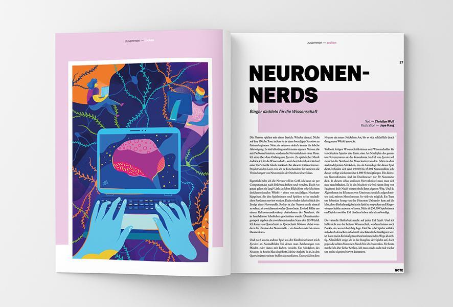
Science Notes 4: “Zusammen” (= together). Authors note: On the right page, there is a short text on citizen science projects in neuroscience and people playing computer games for scientific reasons. The illustration by Jaye Kang shows nicely how the Science Notes design often works in a very free, playful and associative way.
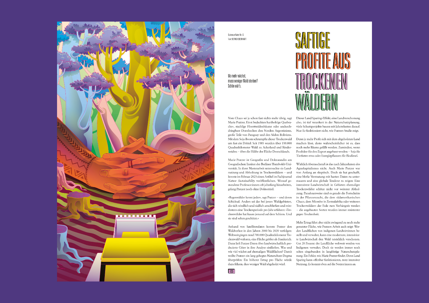
Science Notes 11: “Wachsen” (= Growth). Authors note: Illustration by Ari Liloan for a short text on the decline of dry forests.
KNOWLEDGE, ART AND DESIGN
Science Notes magazine emphasises artistic illustrations, visual art and designs. The printed issues are absolutely stunning and, I would say, almost ingeniously creatively designed. For example, the issue on ‘Growing’ (‘Wachsen’) is a leporello – it is printed in an accordion-like fashion (also called concertina fold or zig-zag fold). Why?
Bernd: Haha, that was the big thing at the book fair to catch people’s attention! It illustrates quite nicely what Sandra wants to achieve with the designs: She wants to contemplate the particular issue’s topic, wants to take it up visually and artistically and also wants to add extra levels of meaning. In this case, she made a magazine that can literally grow – or fall down on the floor, if you are not used to handling it.
What is Science Notes striving to communicate about science and knowledge by emphasising the visual so much – by featuring (scientific) illustrations, unique designs, images of and in science, visual art?
Bernd: Hm, I think this is again this accessibility thing: We do want illustrations, photos, images that invite readers and do not discourage them with their complexity or matter-of-factly design. This does not mean that our designs are simple or do not transport meaning – we have some quite intricate infographics in our issues. But we also want them to be pretty and to match the rest of the design.
Thomas, over to you! How would you describe the overall communicative function of the magazine’s visual style/art?
Thomas: There’s an overarching aesthetic concept to Science Notes that plays a role in all aspects of the project, be it the approaches and stylistics of our texts, the visual and artistic dimension of the magazine or the spatial design of our events. This concept is rooted in a rhetorical approach to science communication that regards aesthetics and design as prime facilitators during the engagement with science. But it’s important to us that design and aesthetics are not only an end in themselves. The visual realm presents a communicative field on its own and we try to be as eloquent as possible in using it. Since the project is situated at the University of Tübingen, we also engage in academic reflection about what we do and we also published a special issue about “Knowledge Design” in the journal Design Issues with MIT Press.
How would you describe the artistic concept of Science Notes?
Thomas: We initially started the magazine as a pretty straightforward science journalism magazine that puts emphasis on narrative approaches to science communication and that makes use of excellent design, photography and illustration. This is something that we missed in other science magazines. But after five issues, we realised that artistic approaches can achieve many different, but equally important, science communication goals we wanted to integrate into the magazine. So we started to include texts by literary writers, we feature art projects that connect to the topic of each issue and each magazine is illustrated by an artist. We broadened the initially much more rigid design concept and now Sandra Teschow, our art director, basically reinvents the magazine for every issue. She experiments with papers, formats, bindings, different approaches to editorial design, and she thus turns the magazine itself into a piece of art.
You also publish about what I would call the weird, wacky and wonderful facets of science in society, for example when you explore the work of artists collaborating with scientists to better understand what it feels like to be a goat (see “Der Ziegenmann” [The Goat Man]), or when you examine questions like “Why do worms sleep?” in light of science. How do such articles fit into the artistic concept?
Bernd: You cannot be a great scientist if you are not able to think out of the box and create really new and surprising ideas. I think many of the really good ideas in science came out of sheer playfulness, of creativity, of weirdness. And since we want to show the whole process of science, since we explicitly want to stress this process-like character of science, we also want to include the wacky ideas and not only the hard results that come out of these ideas in the long run. Plus, they often make good, entertaining stories.
Does the artistic concept also influence the selection of the more scientifically-orientated articles? And how do you actually decide which science topics to explore?
Bernd: We always think of the stories and articles as a whole: Of course, we need a good, serious research project or result as a core. But we also need a story to tell, characters to show, places and ideas to explore… So we never use this un-famous first sentence: “American researchers have discovered that…” We want to show science as a process and tell the stories about that. These are the main criteria for our choices. I wouldn’t say that the artistic concept influences this choice, though. It is rather the case that the artistic concept takes the topics we have decided on to another level.
Is there a specific type of knowledge that emerges from the artistic dimension of the magazine?
Bernd: Um, I don’t know… Isn’t this something that the readers have to tell? 😊
How do you envisage the future of Science Notes? Where do you want to go? Where do you see the magazine in the future?
Bernd: We envisage a bright and shiny future – hopefully! Thomas Hayden and Erica Check Hayden from Stanford University’s and UCLA’s science communication programs wrote in 2018 that “we live in a golden age of science and environmental journalism” – that we have the opportunity to create new ways and formats to communicate science. We want to be a part of that golden age; we try to spread enthusiasm for science and to show people how and why science works, what it can do for them and also what they cannot expect from science. That’s what we want to do in the future with our magazine and also our events – hopefully with a growing and engaged audience!
Thanks, Bernd, Sarah and Thomas, for this fabulous conversation!
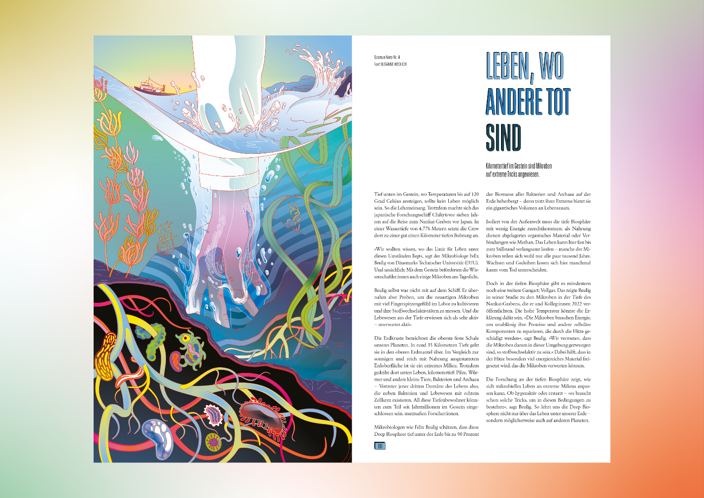
Science Notes 11: “Wachsen” (= Growth). Authors note: Short text on the deep sea microbiome. One of the team’s favourite headlines: “Leben wo andere tot sind” = To live, where others are dead / Life, where others are dead. Nice example for the word-playful headlines we like – it mocks a modern German proverb which translates to “To live, where others are on holiday”.
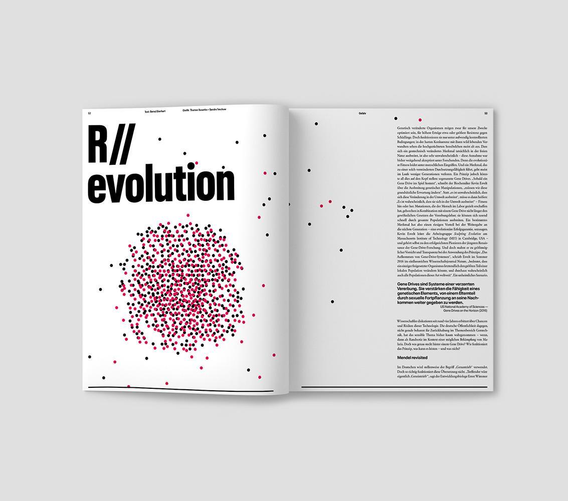
Science Notes 2. Authors note: This text is a deep dive on Gene Drives, really factual, very in-depth. The illustrations by Sandra Teschow and Thomas Susanka try to be explanatory and decorative at the same time.
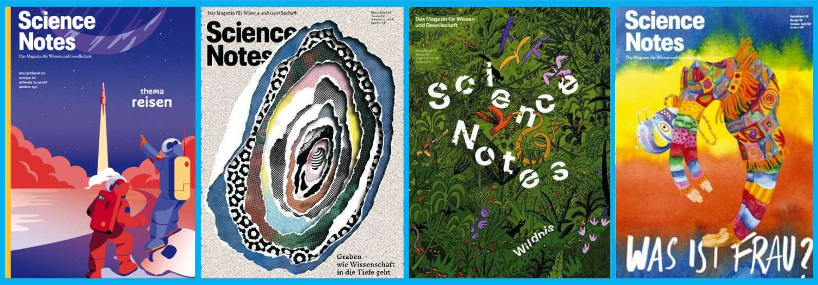
Cover image above the text: Cover pages of Science Notes Magazin. For each issue, Science Notes works together with one illustrator (or illustrator team) who creates all the illustrations in the magazine, from the cover to the last page. From left to right: #8 “Reisen” (= travelling, illustrations by Joseph & Sebastian), #9 “Graben” (= digging, Sacco & Vanzetti), #6 “Wildnis” (= wilderness, Jannik Söllner), #9 “Was ist Frau” (= what means woman?, Hélène Baum Owoyele).
Reference
Science Notes (official website): www.sciencenotes.de
Short bios
Sandra Teschow is a graphic designer and art director of Science Notes magazine. She also designs magazines, books and corporate identities for clients from culture, politics and business.
Thomas Susanka, publisher & editor-in-chief of Science Notes Magazin, does science at the university and in the clubs in the republic. On the long train rides in between, he developed the idea for the Science Notes magazine: topic-oriented, close to research but even closer to the reader, well written and beautifully designed!
Bernd Eberhart is a science journalist and editor of Science Notes Magazin. He is a biologist by training, has co-founded Science Notes Magazin and a student’s science magazine called “Faktor14”. He likes storytelling and science journalism – especially, when both happens at the same time.
How to cite this article
Bernd Eberhart, Sandra Teschow, Thomas Susanka, Anna-Sophie Jürgens and Crystal-Leigh Clitheroe (2024): Science Notes Magazine: Exciting our Visual Imagination about Science. w/k–Between Science & Art Journal. https://doi.org/10.55597/e9829

Be First to Comment