
Text: Milena Damrau, Martin Skrodzki | Section: On ‚Art and Science‘
Abstract: The 2020 annual meeting of the German Mathematical Society saw the first minisymposium on Mathematics and Arts. The introductory article presents a classification scheme for interaction between these two disciplines. In the following collection, each article exemplifies the different cases of the scheme via a contribution presented at the minisymposium.
Cross-disciplinary entities: An interaction model
Since 1998, the Bridges Conference promotes the interdisciplinary presentation and publication of mathematical connections in art, music, architecture, education and culture (Fenyvesi 2016). Douglas G. Burkholder characterises these interactions between mathematics and arts in terms of two extremes: “mathematics [used] to create artwork and artwork that is used to explain mathematics” (Burkholder 2019, 289). While this can serve as a starting point, the connections between these two disciplines are more subtle and complex. To investigate these facets further, we first relate them to the broader interdisciplinary context.
Science philosopher Michael Jungert presents a hierarchy of concepts with an increasing degree of integration of two disciplines (Jungert 2010). Burkholder’s characterisation of the interaction between mathematics and arts best corresponds to the middle ground of Cross-Disciplinarity, discussed by Jungert, which is identified by the usage of methods or research paradigms of one discipline within the other without trying to blend the disciplines (Jungert 2010, 3). Alternatively, Heinz Heckhausen subdivides interaction between two disciplines into six sub-types (Heckhausen 1972). Heckhausen’s third subtype Auxiliary Interdisciplinarity best reflects the observation by Burkholder. It is denoted by one discipline making use “of a method borrowed from another discipline” (Heckhausen 1972, 88). Both classifications have in common that the notion of method is of central importance.
A method is “a way of proceeding or doing something, esp a systematic or regular one” and denotes “the techniques or arrangement of work for a particular field or subject” (Collins). In this sense, a method is applied to some situation or input entity in order to reach an end or an output entity, where neither entity has to be materially realised, but can remain abstract or ideal. Burkholder’s classification identifies both mathematics as a method to reach an artistic outcome and art as a method to reach the outcome of an explanation of mathematics. However, it neglects the input entity, the starting point to which to apply the method. Expanding Burkholder’s scheme and considering the two disciplines (mathematics and arts) as possibilities for the input entity, the method, and the output entity, respectively, provides the complete scheme as given in Figure 1. This expanded scheme contains eight cases. It does include Burkholder’s “artwork that is used to explain mathematics” (case 2) as well as his “mathematics [used] to create artwork” (case 3). The cases 5 and 6 are non-interdisciplinary and therefore only given for the sake of completeness here. Furthermore, cases 7 and 8 challenge this classification as they propose that applying a method from one discipline to an input entity of the same discipline could give rise to an outcome in another discipline, which raises a rather philosophical question not to be settled in the article. This leaves cases 1 and 4 as new additions to Burkholder’s classification. The articles in this collection exemplify all cases 1 to 4. Thereby, they validate this generalised scheme.
All following works have been presented at the online minisymposium Mathematics and Arts at the annual meeting of the German Mathematical Society in 2020. Despite the more than 130-year history of the German Mathematical Society, this minisymposium was the first to establish a connection to arts within the context of an annual meeting. Four sessions with 12 talks investigated Mathematical Learning from Artistic Procedures, The Artistic Object as Learning Inspiration, Imaging Statistics and Statistics of Images, and Symmetry and Geometry. Being held online with a reduced registration fee, the minisymposium allowed for presentations from a very diverse range of speakers from three continents, featuring talks from students, teachers and professionals alike. A selection of talks can be accessed here.
The following contributions are specifically interesting for the w/k audience as they all report on the work of art-related scientists. Not only do the articles exemplify all relevant cases of interaction (cases 1–4), but they also display the non-exclusiveness and overlaps within the scheme.
Anna M. Hartkopf and René M. Broeders discuss a performance based on the abstract mathematical concept of dimensionality (case 1). In contrast, Katharina Hahn considers statistical frequencies of image occurrences in photo books (case 4) and illustrates them through a collage that goes back to the original image entities (case 1). David Honda also creates an illustration, namely that of an eleven-holed torus, which not only manifests the abstract geometric object, but also gives rise to fascinating new mathematical observations (case 2). In comparison, the work of Joshua Holden represents the other side of the coin as he explores a weaving technique using a mathematical model to unleash the full potential of the technique (case 3). Finally, Loe Feijs considers the oeuvre of Piet Mondrian to provide a mathematical rationale how the paintings are structured (case 4). His findings not only give rise to mathematical results, but also provide the readers with insights about Mondrian as an artist (case 3). Both this project and Joshua Holden’s project show the diversity that can occur even within the subfields of the defined scheme. Indeed, both clearly fall within case 3, with an artistic input as well as output and a mathematical method. Yet, Holden’s project produces artistic media, while Feijs’s project is more of an artistic study, with critical or perhaps historical means. The ability to highlight these nuances shows the capacity of the interaction model presented.
References
Burkholder, Douglas G. 2019. “The 2018 Joint Mathematics Meetings exhibition of mathematical art.” Journal of Mathematics and the Arts 13 (3): 288–300.
Collins, https://www.collinsdictionary.com/dictionary/english/method, accessed April 16th, 2021.
Heckhausen, Heinz. 1972. “Discipline and Interdisciplinarity”. In Interdisciplinarity. Problems of Teaching and Research in Universities, edited by Apostel, L., Berger, G., Briggs, A., & Michaud, G., 83–88. Paris: Organisation for Economic Co-operation and Development (OECD).
Jungert, Michael. 2010. “Was zwischen wem und warum eigentlich? Grundsätzliche Fragen der Interdisziplinarität.” In Interdisziplinarität: Theorie, Praxis, Probleme, edited by Jungert, M., Romfeld, E., Sukoppp, T. & Voigt, U., 1–12. Darmstadt: Wissenschaftliche Buchgesellschaft.
Fenyvesi, Kristóf. 2016. “Bridges: A world community for mathematical art.” The Mathematical Intelligencer 38 (2): 35–45.

Can you visualise a four-dimensional figure on stage?
Text: Anna M. Hartkopf, René M. Broeders
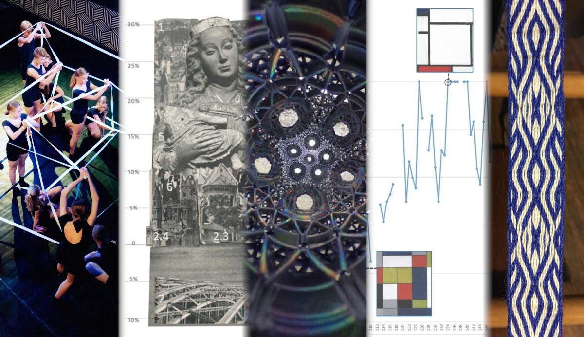
Performing the four-dimensional hypercube in a three-dimensional space is mathematics that by means of performance becomes a piece of art. Therefore, we clearly locate our contribution in the first case of the scheme from Figure 1.
In the BeVoice-project, dance is a very important part of the performance. The idea of the project was that a group of high school students—who were never on stage before, mixed up with young, experienced performers—present a scientific theme via dance. They demonstrate to the audience how science can inspire the development of exciting movements. Our goal was to dance an unimaginable mathematical figure: the four-dimensional cube, which is called a hypercube, see Figure 2 for an illustration.
Our first question was: Can we move in a higher-dimensional world? Patricia van Deutekom, one of the artists behind the process said:
“As soon as you’re starting to move, you are working in dimensions. There is also a dimension between you and your partner.”
Normally, everything you see on a stage happens in a three-dimensional space. But in a movie, it is possible to show a three-dimensional world on a two-dimensional screen, just like you are drawing the x-, y- and z-axes on a flat paper to show a cube. We modelled the transition from the fourth to the third dimension quite similarly, via projection.
First, the choreographers were shown an animation of the hypercube. In order to give them some intuition for its composition, we explained: analogously to the three-dimensional cube, whose faces are squares (i.e. two-dimensional cubes), the hypercubes’ sides are three-dimensional cubes. The hypercube has eight cube-shaped sides. However, because the hypercube is first projected into the three-dimensional space, these faces do not appear symmetrical to the viewer anymore, even though they are in the four-dimensional object. Any animation of this cube must then again be projected onto a flat screen. In our performance we aimed to show the rotation of the hypercube in the three-dimensional space, which—to the best of our knowledge—has never happened before on stage.
Each of the corners of the hypercube is visualised by a single performer. The lines between them needed to be flexible, to allow for the movement in the rotation of the cube. Hence, we used white elastic bands which connected the dancers and represented the edges of the hypercube. The performance took place on a black stage with dancers wearing black outfits to contrast the geometrical elements, see Figure 2.
The most magical view of rotation of the hypercube is when the inside square is growing and coming outside of the cube. We saw the performers put in their flexibility and passion, which was the moment the performance became art – and for the first time ever one could see the hypercube rotating in space. Follow this link to watch a short documentary about the performance.
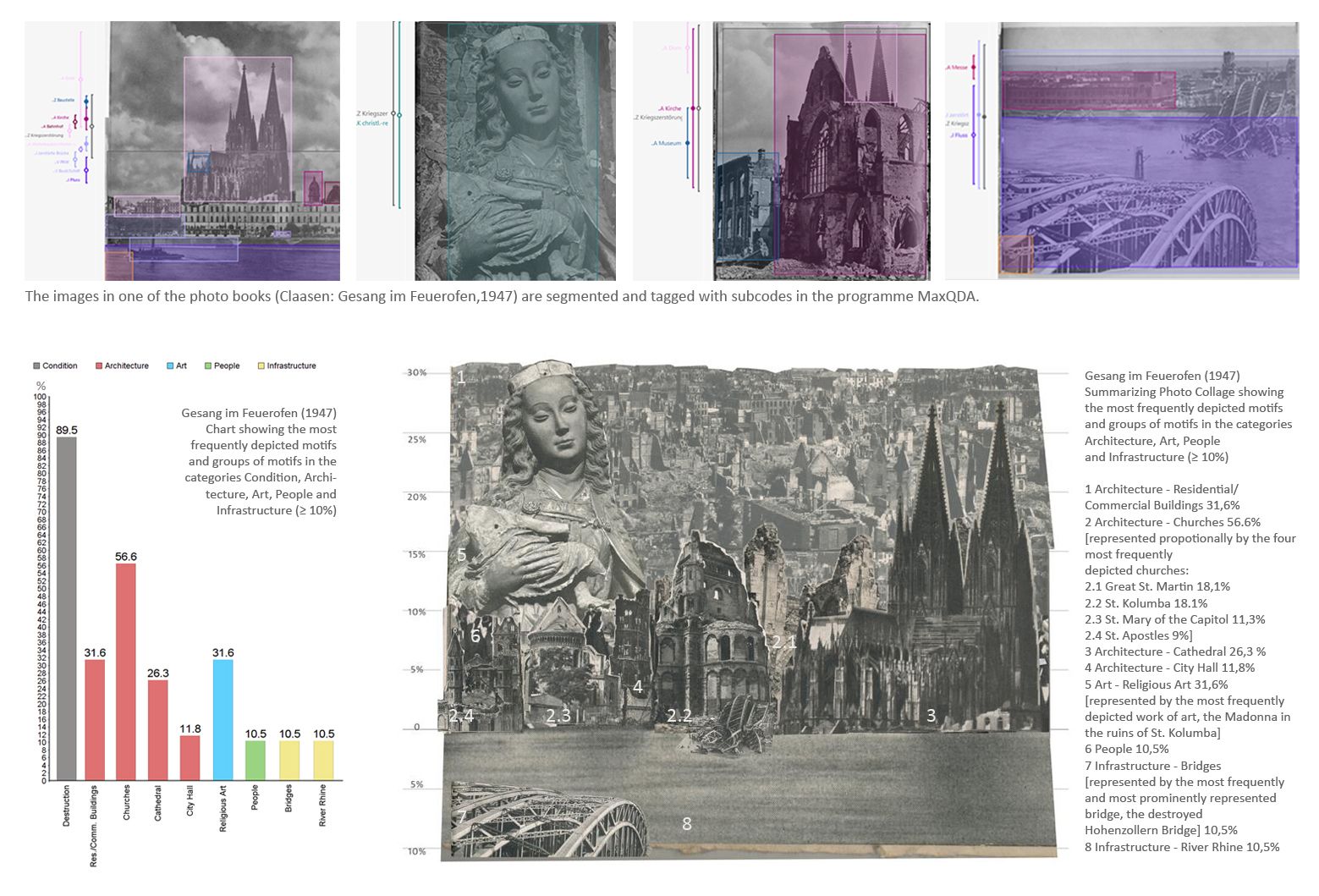
Photo collages as visual summaries of photo books
Text: Katharina Hahn
This project aims to summarise image-related research results using photo collages. Two different cases of the scheme in Figure 1 are used. First, the input is based on photo books (artistic representations of cities) and the method is counting motifs and collecting data about their representation. The outcomes are motif frequencies linked to qualitative data (case 4). Second, based on this quantitative and qualitative data, a photo collage is created through an image-generating process that incorporates these findings and is itself an artistic work (case 1).
Image-related research requires multiple transformations from visual to verbal code. With each transformation, the risk of misinterpretation by the reader is enlarged because of the predominant non-indexability of the visual (Langer 1942; Grittmann and Lobinger 2011). Due to the challenges of communicating image-related research results with less translational alienation and data loss, I introduce an innovative form of summarising photo collages.
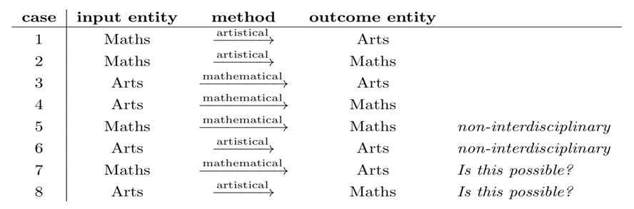
For my research project, I am examining photo books as urban self-presentations. In one aspect, I examine how and how often certain motifs are shown in photo books. Frequencies are an important aspect for the investigation of visual representations (Schmidt and Eisend 2015) and a central component of the results I want to communicate. The repetitions of motifs and motif- or style-related correlations in the photo books generate a hierarchical emphasis of meaning. Based on the results of the frequency-based content analysis, the summarising photo collages are an appealing way to illustrate this.
The collages are created in a graphics editor from the material digitised for the investigation. For every motif that appears with a frequency of at least 10%, cutouts are chosen from the photo books. This happens according to the criteria that they reflect the stylistic and spatial representations of the respective motifs in the photo book as characteristically as possible. The cutouts are cropped and arranged in different layers of a new image document that has a frequency scale on the left side. In the final collage, the size of the cutouts reflects the frequency of the respective motifs. The position of the cutouts is oriented according to geographical locations in the city as shown in the photo book.
This allows demonstrating, for example, that the frequent pictorial representation of certain motifs in spatial proximity generates specific messages. The collages also enable to include stylistic features like the point of view, angles and technical factors such as focal lengths that have a significant influence on the meaning of the visual messages mentioned. Compared to conventional graphics such as bar charts, these are significant advantages.
In the upper part of Figure 3, you can see some pages from one of the photo books investigated (Claasen 1947). The images are segmented and tagged with subcodes in the programme MaxQDA. Bottom left, you see a bar chart, created from the motif frequency data. On the right side, you see a summarising collage that has also been created based on the analysis data. Unlike the graph, the collage not only shows frequency values, it also takes into account in which context and how prominently the motifs were presented and additionally shows their spatial position in the cityscape.
The summarising collages I presented have decisive advantages and possible uses, especially for city-image related research. They summarise the corpus of research results from which they are generated, while preserving frequently registered image-specific characteristics like content-related and stylistic features. They serve the scientific interest by facilitating access to the represented content and, corresponding to the nature of images, allowing the viewer to recognise contexts of meaning at a glance. Adapted to visual conventions, the design of the collages supports the access to the knowledge imparted. This method enables to compare and communicate investigation results while avoiding a misinterpretation of content by linking back directly to the source material. In summary, the creation of these summarising collages itself is an image-generating process that serves to gain knowledge about the interpretations offered by photo books.
References:
Claasen, Hermann. 1947. Gesang im Feuerofen. Köln – Überreste einer alten deutschen Stadt. Düsseldorf: Schwann.
Grittmann, Elke, and Lobinger. Katharina. 2011. “Quantitative Bildinhaltsanalyse.” In Die Entschlüsselung der Bilder. Methoden zur Erforschung visueller Kommunikation. Ein Handbuch. Edited by Petersen, Thomas & Schwender, Clemens. Köln: Herbert von Halem.
Langer, Susanne K. 1942. Philosophy in a New Key. A Study in the Symbolism of Reason, Rite, and Art. Cambridge Mass: Harvard Paperbacks.
Schmidt, Susanne, and Eisend, Martin. 2015. “Advertising Repetition: A Meta-Analysis on Effective Frequency in Advertising.” Journal of Advertising 44 (4): 415–428.
“Big Boy Blue”
Text: David Honda
This project illustrates the use of snapology origami for discovering mathematical statements. The input entity is the mathematical concept of a geometric object and the method is artistic (snapology origami). The outcome is an understanding of the geometry via a spherical image of the created sculpture, which corresponds to case 2 from Figure 1.
The presented piece Big Boy Blue is an example of snapology origami, a medium pioneered by Heinz Strobl. It involves the interconnecting of rectangular strips of paper. I became interested in snapology because of my background in origami as well as being a math teacher. The medium naturally lent itself to exploring various mathematical concepts (polyhedra, convex and concave surfaces, saddle points, topology, etc.) in a tactile way. The inspiration for this particular piece was to create a model with an internal structure. One of the challenges in my work is that as my pieces have grown in size, the issue of weight vs. support has become a challenge. I wanted to see if I could build something that was mathematically and visually pleasing, but also structurally sound.
A first version of this piece was exhibited at the 2018 Bridges Math Conference at the Joint Mathematics Meetings, where it won first prize in the category “Best Textile, Sculpture, or other Medium”. In the current piece Big Boy Blue, I wanted to widen the holes so that it would be possible to insert a spherical camera inside. From a purely aesthetic point of view, I decided to go with an iridescent material internal dodecahedral section to add some mystery for the viewer catching glimpses of the internal section from the outside. The final piece is about 46 centimetres in diameter and weighs about 3.5 kg, see Figure 4.
The overall shape is based upon a twelve-sided dodecahedron, i.e. on one of the five platonic solids. Because of the size and weight of the object, it is not easy to visually establish the number of sides of the object. By inserting a spherical camera into the sculpture and by considering the flattened version of its spherical image (right part of Figure 4), it is easy to count the eleven visible holes (as the 12th side is stretched to the border of the image). This confirms that, topologically speaking, the piece can be considered an 11-holed torus. An interactive version of the spherical image can be experienced at this Facebook link. The mathematical object itself is abstract, its artistic realisation is heavy and not easy to interact with, but the stereographic projection easily reveals the topological properties of the object.
Follow this link to see more photos and descriptions of the piece presented. For more information about snapology origami see this talk I gave at the Joint Mathematics Meetings in 2018.
Markov chains and egyptian tombs: Generating ‘Egyptian’ tablet weaving designs using mean-reverting processes
Text: Joshua Holden
This project began with an artistic medium that imposed a design restraint and used a mathematical process to generate artistic patterns obeying the constraint. This corresponds to case 3 of the scheme in Figure 1.
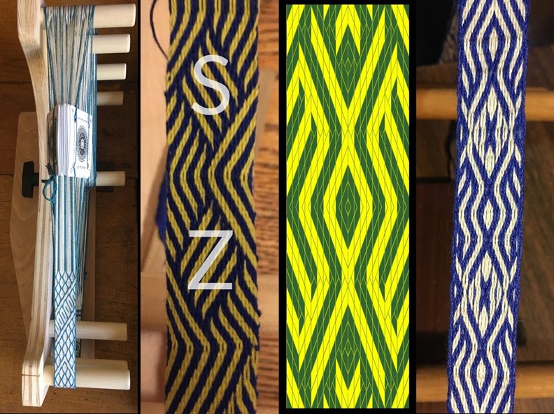
Tablet weaving is a method of making strips of cloth using very simple equipment. Vertical threads are passed through holes in tablets or cards, as shown on the far-left part of Figure 5. The cards are turned to manipulate the structure and pattern of the weave. Horizontal threads are passed between the vertical threads to hold them in place and lock them together. One well-known type of pattern is called Egyptian Diagonals, as it resembles pictures of fabrics found in Egyptian tombs. The characteristic design element of this technique is an angled boundary between areas with stripes in the Z (lower left to upper right) direction and areas with stripes in the S (lower right to upper left) direction, as shown in the centre-left part of Figure 5 (Collingwood 2015, 109).
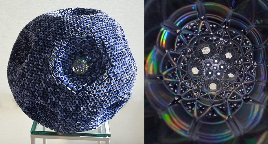
One difference between tablet weaving and other types of weaving is that the threads from each card are twisted around each other as the piece is woven. If the equipment is not specifically designed to account for this, it is important to design patterns such that the twist is more or less balanced. For Egyptian Diagonals, the direction of twist is determined by whether the diagonal is in the Z or S direction. Therefore, it is important to keep the number of Z diagonals and S diagonals roughly equal for each vertical column of four threads. This inspired the idea of using a mean-reverting random process (Kac 1947) to generate random Egyptian Diagonal designs. Since the weaving pattern consists of discrete steps, it is reasonable to model it with a Markov chain, which is a random process where the probability of each event (in this case, the choice between an S and a Z diagonal) depends only on a discrete parameter describing the system (in this case, the total amount of twist).
The author has written a computer programme in the Processing language to generate random patterns according to the procedure defined above. A sample output is shown in the centre-right part of Figure 5. It was originally hoped that the mean-reversion property would frequently result in all columns achieving balanced twist simultaneously after a reasonable amount of time. However, this has not proved successful. In order to generate designs that can be repeated along a strip of fabric, the programme reverses the direction after a specified number of steps and generates the mirror image of the original pattern. Since many tablet weaving patterns also have a line of symmetry along the length of the band, the pattern was additionally mirrored along this line. The far-right part of Figure 5 shows an example of the final woven product.
References
Collingwood, Peter. 2015. The Techniques of Tablet Weaving. Brattleboro, VT: Echo Point Books & Media.
Kac, Mark. 1947. “Random Walk and the Theory of Brownian Motion.” The American Mathematical Monthly, 54 (7): 369–391.
Analysing the structure of Mondrian’s 1920–1940 compositions
Text: Leo Feijs
This project aims at an improved understanding of Mondrian’s processes and his art. The input entity is Arts (all of Mondrian’s works from 1920–1940), the method is mathematical (semi-automated reconstruction of the painting’s topological structure, and inferential statistics). The outcome is Math: numerical information, yet relevant for art-scholars and for artists making new Mondrian-inspired artworks. This corresponds to case 4 from Figure 1. However, understanding the artist’s processes also provides a better understanding of the artworks (as outcome), which additionally identifies this analysis as an example of case 3 from Figure 1.
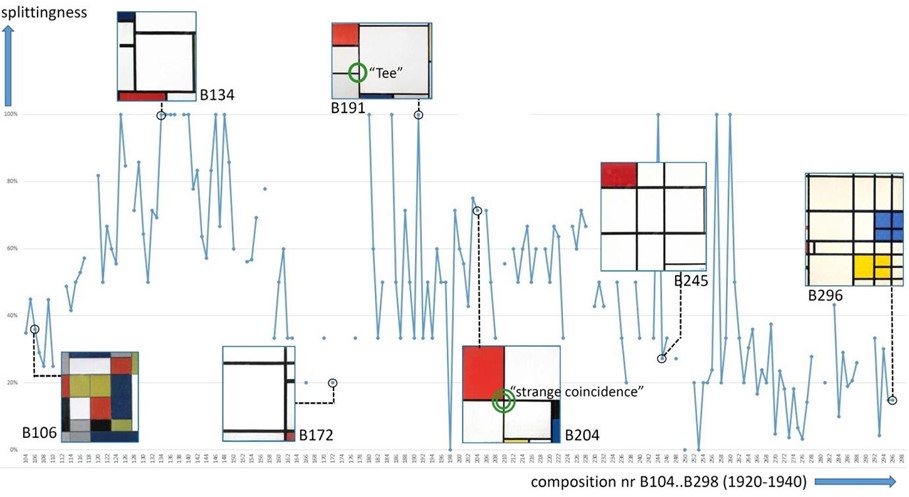
Mondrian was one of the most significant painters of the twentieth century. He worked restlessly to find expression for the purest possible kind of beauty and truth, based on a theory called Neoplasticism (Blotkamp 1994). Question: Is it possible to generate (most) (parts) of his work using a simple algorithm? Coding a ‘Mondrian’ generator using recursion is a popular classroom exercise for computer programming. However, this leaves the impression that this approach is valid for all of Mondrian’s 1920–1940 compositions. The research question is to what extent Mondrian’s compositions can be obtained by recursive binary splitting of a white rectangle, marking each splitting with a solid black line and finally filling some of the un-split rectangles with grey or primary colours.
In the following, we denote T-intersections of black lines as ‘Tee’. For example, Composition with red, yellow and blue, B191 (1927) has eight Tees, see Figure 6. Differently, Composition with red, black, blue, and yellow, B204 (1928) has seven Tees and two of these Tees are part of a ‘strange coincidence’ (they form a crossing, in fact). I define the splittingness of a Mondrian painting as the percentage of Tees not part of a strange coincidence. For B204 it is (7-2) / 7 = 71%. My special interactive reconstruction tool works under the assumption that all lines are splitting lines: it will extend each selected line segment in both directions until it either hits an earlier line or the edge of the canvas. Thus I find all Tees and all strange coincidences are computed automatically. The Catalogue Raisonné (Joosten and Welsh 1996) and the website of RKD enable a new type of Mondrian research: I could analyse (almost) all paintings.
The splittingness of all eligible 150 paintings from 1920–1940 has a mean of about 50%. We define the splitting hypothesis as the claim that Mondrian’s compositions can be obtained by recursive binary splitting. A statistical Wilcoxon test reveals the splitting hypothesis to be generally false. For the details we refer to (Feijs 2020).
In summary: Is it possible to generate (most) (parts) of his work using a simple algorithm? Mathematics shows: Not all of it, but about half of it. Even for this half, further research is needed to understand where the splitting lines should be and how to select the colours. Nevertheless, it shows us the depth and complexity of Mondrian’s work and therefore teaches us about his artistic processes.
References
Blotkamp, Carel. 1994. Mondrian: The Art of Destruction. London: Reaktion Books.
Joosten, Joop and Welsh, Robert. 1996. Mondrian: Catalogue Raisonné. New York: Harry N. Abrams Inc.
Feijs, Loe. 2020. Analyzing the Structure of Mondrian’s 1920–1940 Compositions. arXiv:2011.00843 [cs.CY].
Picture above the Text: Math/Art Interactions (2021). Copyright: The authors.
Citation style
Milena Damrau, Martin Skrodzki, Anna M. Hartkopf, René M. Broeders, Katharina Hahn, David Honda, Joshua Holden, and Loe Feijs (2021): Combining Mathematics and Arts. w/k – Between Science & Art. https://doi.org/10.55597/e6876

… [Trackback]
[…] Read More Information here on that Topic: between-science-and-art.com/mathematics-and-arts/ […]
… [Trackback]
[…] Read More Info here on that Topic: between-science-and-art.com/mathematics-and-arts/ […]
… [Trackback]
[…] Find More on on that Topic: between-science-and-art.com/mathematics-and-arts/ […]